333 opens a new section in which it presents statistics of the pig sector. Initially we will have data about censuses, meat production and the structure of the farms in the European Union countries.
All the information is presented in a graphic format that is very visual, simple, quick and easy to use. It is possible to compare different countries during different periods of time, interchanging various displays in a very quick way according to the kind of information that we wish to obtain.

The data
At present we show statistics of the EU countries regarding the number of animals, meat production and structure of the farms. The information concerning the censuses and the farms is classified according to the different categories of pigs, whilst the data referring to the meat are presented in tonnes or in number of animals slaughtered per year. In the last case we also do a monthly monitoring.
The data are distributed according to the different countries and they entail current and historical information from 1969 until today, depending on the country.
We expect to expand this section shortly with regard to new subjects and to the number of countries.
Graphic formats
We have different graphic formats that are easily interchangeable depending on the kind of data that we wish to look up. We can also select different periods of time (![]() ). The option for seeing the results in full screen
). The option for seeing the results in full screen ![]() will facilitate the simultaneous display of a great amount of data.
will facilitate the simultaneous display of a great amount of data.
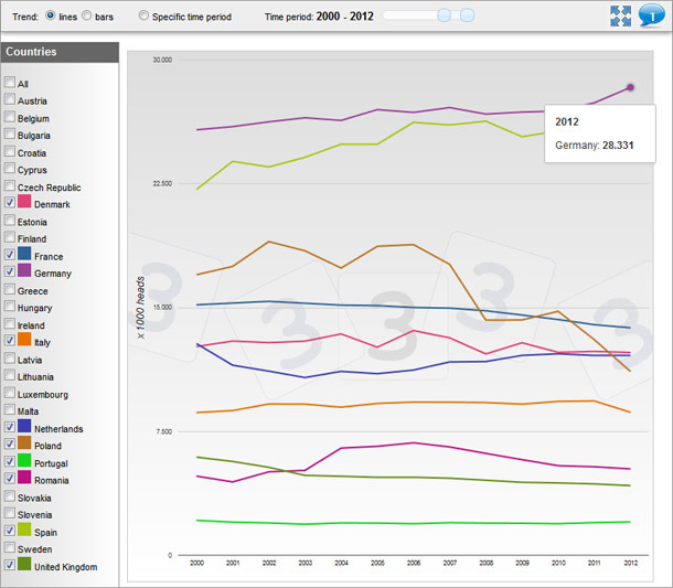
So, for example, the following lines graph allows us to see the evolution of each of the selected countries at the same time that we compare them.

Graph 1. Evolution of the census of pigs in the main EU producing countries from year 2000 to year 2012.
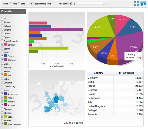
If we choose the specific situation format, apart from the comparison in terms of absolute numbers, we will see the percentage distribution for a certain year along with a degraded colour map in keeping with the magnitude of the census.
Graph 2. Distribution of the pig meat production in the main EU producing countries in year 2012.
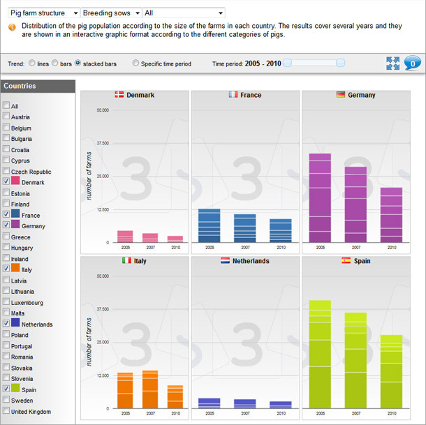
The following stacked columns graph gives us a quick idea about the number of farms in each country and the evolution that they have followed. To see a single country in more detail we will click on its graph.
Graph 3. Evolution of the number of sow farms in different countries.
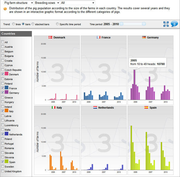
If we interchange the format for a columns graph we will see more clearly the evolution of the number of farms, according to their size, in each country.

Graph 4. Evolution of the number of sow farms in different countries from year 2005 to year 2010 according to their size.
All the information about a country
It is possible to get a compilation of the complete information of each country selecting the flags in the section index.
Comments
Participate in this section by writing comments that help to explain the data. These comments will be available to all the users.
The most recent comments are shown in the main page of the section. On the other hand, once we have gained access to the graphs area, we will be able to see the comments and also to write comments by clicking on the icon ![]() . Inside each comment we will click on
. Inside each comment we will click on ![]() to obtain the image about which the comment has been made.
to obtain the image about which the comment has been made.
Access
The access to all the information is free, but in most of the cases it is necessary to be a registered user in 333 and have logged in order to see the results. The subjects with a lock icon require authentication in order to gain access to them.


