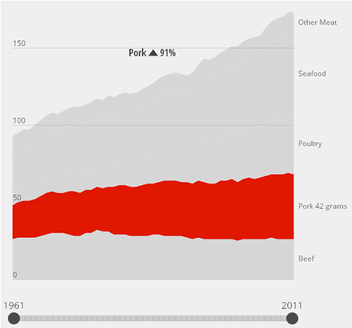
"What the World Eats" is a new interactive graphics, created for National Geographic’s Future of Food series, that compares national diets and consumption patterns across a variety of countries over the last 50 years.
The project breaks down the food items that fuel daily diets in each country, and also shares a detailed view of national and per person meat intakes. By toggling between daily diet breakdowns and daily meat consumption, users can compare how countries consume varying quantities and calories of different foodstuffs over time, in addition to exploring the greater structural circumstances that influence the way people eat around the world.


The data was sourced from FAOSTAT. Values reflect dometic utilization for food comsumption in each country or region from 1961 to 2011.
Thursday October 16, 2014/ National Geographic.
www.nationalgeographic.com/


